


Building a custom home is just the start. After all the construction is done, homeowners are faced with another daunting task- decorating. Interior design can be hard, especially when it comes to picking out the color palette for the whole home. There’s such pressure for people to have the perfect HGTV-Pinterest worthy homes. You don’t have to spend a ton of time and money to have the perfectly styled home though. Follow these simple tips on picking the perfect color palette for your new custom home and soak in all the praise.
Follow the Rule of Three
The rule of three is a classic interior design trick. Simply limit your palette to three colors in any space. Three is the magical number for colors. It has enough so that it’s interesting, but not so many that it’s overwhelming. If you have an open concept space, with multiple rooms opening into one another, this rule really helpful. Pick one color to be the main one in each room, and use the other two to accent. This helps define each space, all while they still compliment one another.
Go Monochromatic
When in doubt, pick one color and run with it. Shine a spotlight on your favorite color by filling a space with that color. A bold color works best in smaller spaces, like bathrooms. Make sure to break up the monochromatic color with some neutrals. For example, if you go with a bold green, use white also. This allows your eyes a resting spot, which makes the color pop more. Overall, you will have a bold yet balanced room.

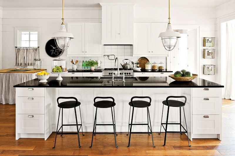
Rely on Timeless Pairings
There’s a reason certain color combinations have become classic pairings. They’ve made it through the test of time and have repeatedly looked good. Black and white are a dynamic duo of colors that never go out of style. It’s a chic, timeless color palette that can easily be altered by introducing accent colors and metallic.
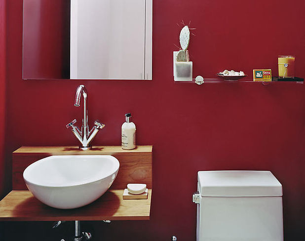
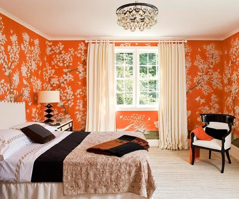
Go Bold in Small Spaces
People tend to think that smaller spaces need light colors, like white, to make them appear larger. While this might be true, in a small room like a bathroom, no amount of paint will make it appear large. Using a bold color can actually give it an oomph that will give it more of a presence than if you went white. Don’t be afraid to go bold in smaller space. In fact, we encourage it!
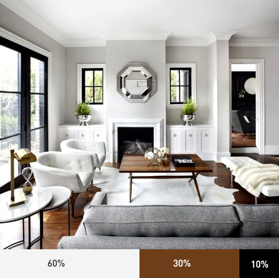
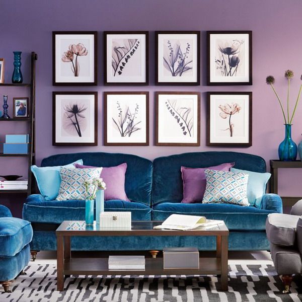
Use the 60-30-10 Rule
This rule is all about a balanced ratio of colors. When decorating the space, divide the color up into 60% of a dominant color (like walls), 30% of a secondary color (like fabrics), and 10% of an accent color (like decorations). It’s a simple rule that works like a charm.
Take Cues from Clothing
We tend to wear colors that make us look and feel our bests. If your wardrobe is mostly bright colors, then mirror your home after that. And if you’re more into neutrals, go that route. Just like clothing, you should dress your home in colors that you feel comfortable in.
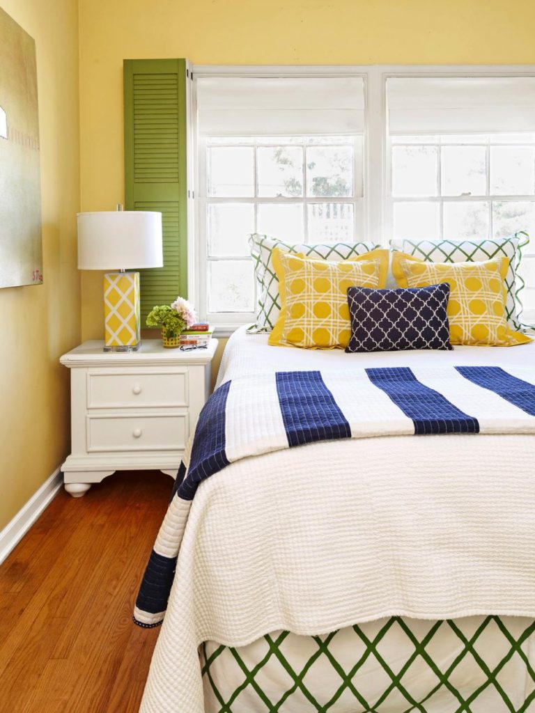
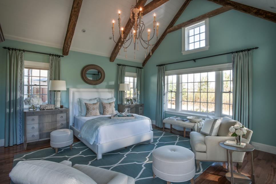
Use the Color Wheel
There’s a reason children are introduced to the color wheel in elementary school art class. It’s a simple tool that lets you see what colors look good with each other. Analogous color schemes (colors next to each other on the wheel) tend to be more casual and relaxing. They work well in informal and private spaces like bedrooms.
Start in Formal Areas
Custom home builders recommend that you start in more formal areas of the home. The living room, dining room, and entryway are good places to begin. Pick color schemes for these rooms first, and then pull one color from here to use in other spaces. If you use a bold blue in the living room, you may tone that down to a navy for an office.
Go Dark to Light Vertically
Take cues from the outdoors, and decorate darker to lighter going up. Use darker colors on the flooring, medium colors on the walls, and light on the ceiling. Since it mirrors the outside world (darker earth to the lighter sky) it feels more natural to us in an interior space.
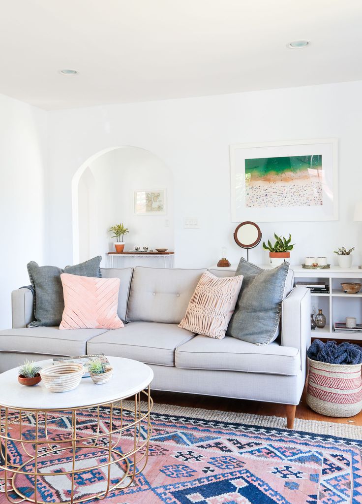
Pull Colors From Largest Pattern
If you already have a patterned rug or an upholstered sofa, pull colors from those. Patterns draw our eyes, so if the rest of the room doesn’t compliment the dominant item, a room will look funky. If you’re looking for neutrals to compliment a pattern, pull from the whites and beiges you find in it.
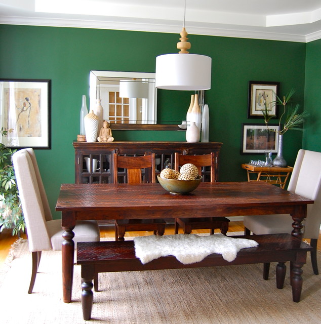
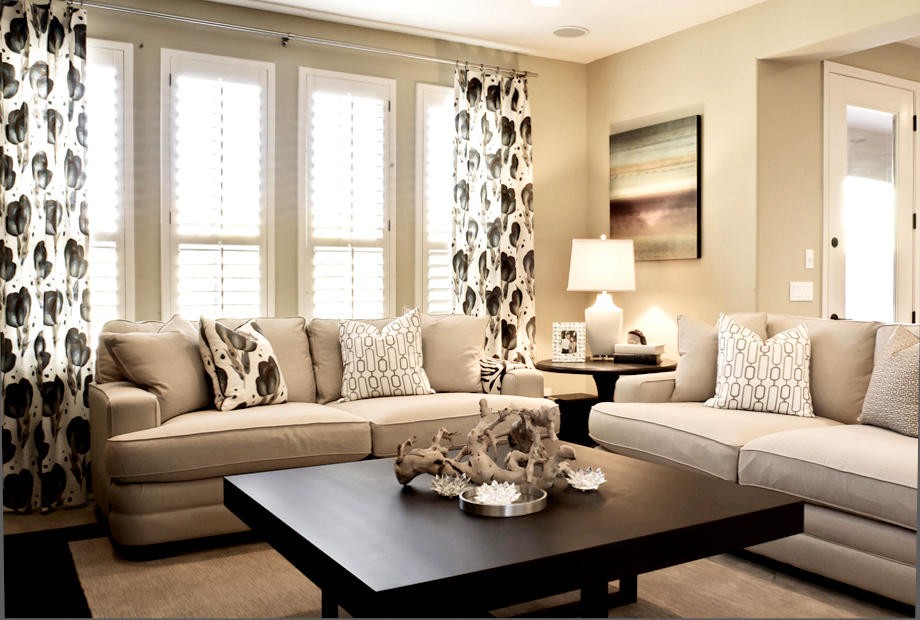
Stay Neutral
When in doubt, stick to neutrals. A room full of varying creams or grays will always look put together. If you don’t like color, or simply can’t settle on one, don’t use any at all. Going with all neutrals is a popular color palette and it has the added benefit of making a home look more luxurious.
Picking the perfect palette for your custom home can be a daunting task. While these tricks are great, at the end of the day it’s about you loving your home. Go with what styles and colors you enjoy living in. Contact us if you want to get started building your custom home.


